How to Read the Step-by-Step Forecast Behind Your Startup Numbers
Your P&L can show that something is wrong. A step-by-step forecast helps you see why. This article explains how to trace revenue, growth, costs, and cash back to the operating logic behind them — so your model becomes a real decision tool, not just a summary for investors.
Why founders need more than P&L, Cash Flow, and Unit Economics
A model becomes substantially more valuable when it stops acting like a static fundraising attachment and starts working like an operating instrument. High-level views are essential: P&L clarifies profitability structure, Cash Flow clarifies liquidity and runway pressure, and Unit Economics clarifies whether growth quality can carry acquisition and service costs.
Those are summary lenses. They show what happened in financial form. They usually do not reveal the chain of operating events that produced the result. Early-stage decisions often depend on that chain: where conversion softened, where churn changed, which cost layer stepped up, or when financing landed relative to burn.
The detailed forecast layer closes that gap. It lets founders trace how assumptions become subscribers, how subscribers become revenue, and how usage plus operating choices become monthly burn and cash movement.
What a step-by-step forecast actually shows
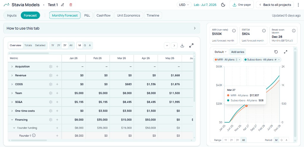
A step-by-step forecast is a month-by-month operating breakdown behind headline metrics. Instead of only showing final lines, it exposes the sequence: acquisition inputs, user flows, paid subscriber movement, pricing and billing mix, product-serving cost layers, payroll timing, overhead timing, and financing events.
In a bottom-up startup model, this sequence is the core value. The purpose is not only to output a top-line number; it is to connect outcomes to concrete mechanics that can be changed, stress-tested, and explained.
Start with the high-level signal, then go deeper
A practical reading flow starts with the summary lens where the issue first appears. Founders usually notice the signal in P&L, Cash Flow, or Unit Economics: revenue below plan, weaker gross margin, tighter runway, slower subscriber growth, or EBITDA lagging the expected path. That first signal tells you where to look, but not yet why it happened.
The next step is to pick the metric that feels off and trace its chain in the step-by-step forecast layer. If ending cash compresses, inspect hiring and financing timing plus operating cash lines. If margin weakens, trace serving-cost components and free-user load. If growth slows, inspect conversion and channel quality before changing budget levels. This sequence helps isolate the operating driver instead of reacting to the surface symptom.
Once the driver is clear, the model becomes actionable: revise the assumption, then revise the decision. That could mean a pricing or packaging change, tighter cost discipline, a different channel mix, or moving a hiring or financing event to better match the company’s timing reality.
From summary signal to root cause
Spot the signal in a summary view, trace the mechanism in the detailed forecast layer, then act on the real driver.
Start view
Where the issue first appears.
Signal spotted
Identify the metric that looks off.
Step-by-step forecast
Trace the operating chain behind it.
Driver found
Separate root cause from symptom.
Decision
Revise the assumption or operating move.
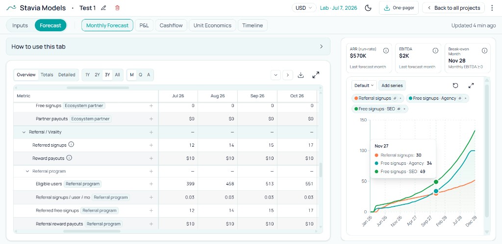
Example 1: tracing acquisition logic
Suppose customer growth looks softer than planned. A summary view tells you pace is behind. The detailed acquisition rows tell you where the bottleneck is: signup volume by channel, referral behavior, partner contribution, and progression from exposure into real users.
That detail changes decisions. You can separate experiments from scalable channels, see which sources bring qualified users, and adjust channel strategy based on mechanics rather than impressions.
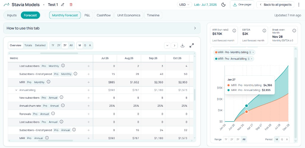
Example 2: tracing revenue logic
Total MRR can look healthy while the underlying mix drifts in risky ways. The detailed revenue rows show which plans are carrying growth, how monthly versus annual billing is shaping the curve, and how subscriber movement plus churn is feeding each line.
This view is especially useful for pricing work: you can see whether a plan is creating durable value, whether billing design is helping cash timing, and whether growth quality depends too heavily on one segment.
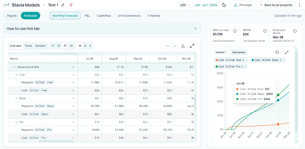
Example 3: tracing cost-of-revenue logic
In SaaS and AI products, cost of revenue is rarely one flat ratio. It often depends on payment rails, usage intensity, API consumption, free-tier behavior, and plan-specific serving patterns. The detailed COGS rows reveal which users and product layers are actually generating cost pressure.
This is where founders can see a practical truth early: free users are not free when the product spends real money to serve them. That insight affects freemium design, trial policy, plan limits, and margin targets.
How this helps with strategy, not just fundraising
Investor readiness is a visible benefit because conversations improve when founders can explain logic behind the numbers, not just show outputs. Day to day, the bigger value is strategic: this detailed layer supports commercial planning, pricing and packaging decisions, cost discipline, and growth pacing as conditions change.
It also improves internal alignment. Co-founders, operators, and advisors can discuss trade-offs using one shared mechanism view instead of debating isolated KPIs. During fundraising, the same clarity helps founders defend assumptions under scrutiny: why growth ramps at that pace, where margin pressure comes from, and why runway timing is or is not realistic.
This is why the model should remain active between fundraising cycles. Used well, it becomes a working decision system for product and go-to-market strategy, with finance views and operating logic reinforcing each other.
How Stavia Models implements this
In Stavia Models, this detailed step-by-step forecast layer is implemented in the Monthly Forecast tab. The goal is not simply to show a large table. It is to expose the operating logic behind acquisition, revenue, costs, payroll, financing, and timing drivers so high-level outputs remain explainable.
The chart area in this view is part of that diagnostic workflow. You can add selected series and compare them over time, which makes patterns easier to read and relationships easier to validate.
For assumption-building context around this workflow, founders typically move through pricing, acquisition, cost structure, cost of revenue, overhead, payroll, and financing.
Common mistakes
Conclusion
Strong startup models combine summary and detail. P&L, Cash Flow, and Unit Economics show the overall shape of the business. A step-by-step forecast makes that shape explainable through operating logic.
This is what turns the model into a tool for building a company: you can see how visits become signups, how users become subscribers, how subscribers become revenue, and how the business spends money to create and serve that value. The step-by-step layer is one view inside a financial model for startup decisions where P&L, Cash Flow, and Unit Economics share the same assumptions.
About the author

Anastasiia Nikolaeva
Founder of Stavia Models
Anastasiia Nikolaeva is a financial modeling consultant and the founder of Stavia Models. She has built financial models for SaaS, AI, marketplace, and other startup business models, helping founders plan pricing, growth, fundraising, and unit economics. Stavia Models is based on this hands-on consulting experience and turns that modeling logic into a guided product.